Wes Andersons style of directing is easily recognisable for its distinct and unique frame symmetry, aspect ratios, and perfectly arranged scenery.
A very noticeable thing about The Grand Budapest Hotel is the colour ratio. The colours are very bright and distinct, creating the feeling of a rich and bright environment. This makes certain scenes more memorable because of their stunning and gorgeous visuals. It is also used in one scene to convey to the audience that the scene is a grim and bleak time in Zero’s (Tony Revolori) life. This is done by making the scene completely black and white.

Another thing that the film is known for is the way that Anderson switches aspect ratios between the four different time periods. The ratio shrinks as the film goes back in time, starting at 16:9 in the opening scene, set in modern day, and transitioning to 4:3 in the 1930’s. This gives each scene its own distinct feel and aesthetic, and also brings the audience into the feeling of films made around that time period.
The film also uses zeitgeist to create the feeling of Eastern-European culture in the 1930’s through the clothes that people wear, the furniture and architecture, and and even the re-occurring trend of moustaches.
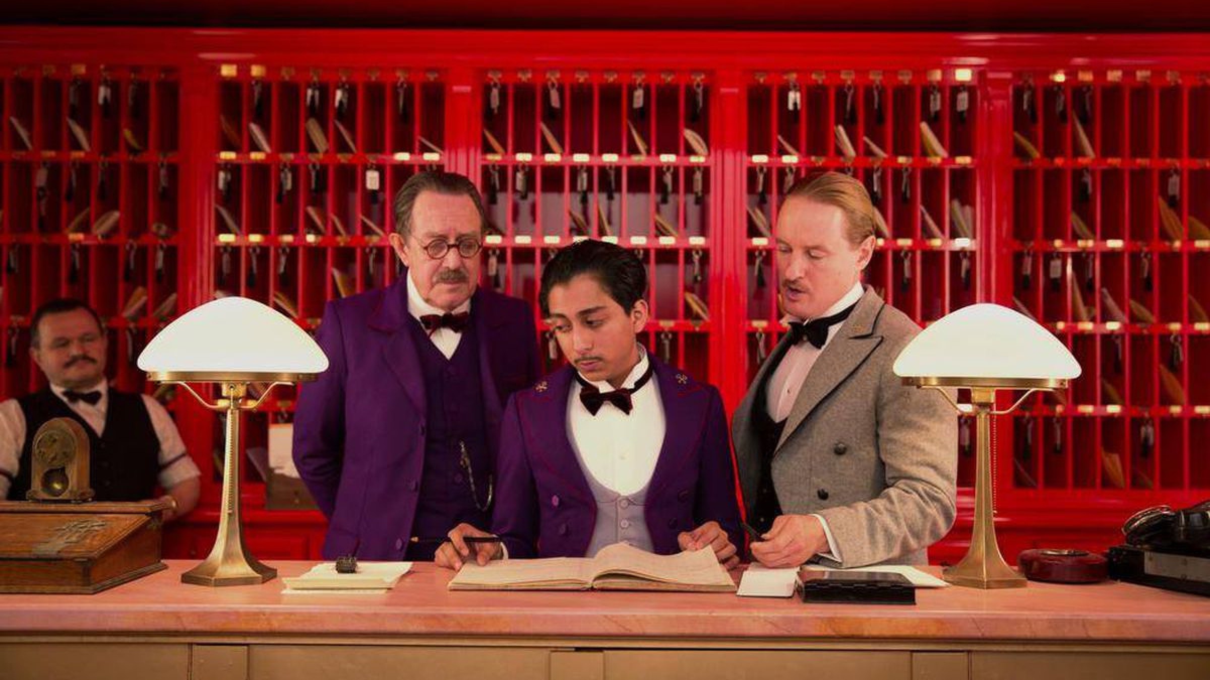
Almost every shot is also perfectly framed/centred. This involves placing characters and buildings and items centre frame. It also leads to shots being more symmetrical, which an equal amount of characters on each side of the frame, and buildings being perfectly balanced and symmetrical too. This creates the feeling of the time period the film is set in in a particular scene, and it also makes the colour scheme more balanced and aesthetically pleasing, like the rest of the film.
The editing is slow and avoids shots as much as possible, the mise-en-scene is arranged perfectly to create the feel of the place and time-period, the cinematography is done to place things perfectly centre-frame to show the importance of certain things and to make the shots more pleasing and symmetrical for the audience to look at.

You must be logged in to post a comment.